As part of the application process, you’ve been requested to complete the following challenge. If you have any questions please respond to the last email you received from our team.
Your Challenge: Create a better checkout
In this challenge, you will be designing a new and improved UI for the checkout on an ecommerce website.
This is a theoretical exercise designed to help us compare candidates for the role in a simulation of a common task you’ll be doing for our products if you’re the successful candidate. Our goal for us is to evaluate your ability to streamline and enhance the user experience.
Background:
Users have reported that the current checkout process is confusing and time-consuming, leading to a higher than average cart abandonment rate.
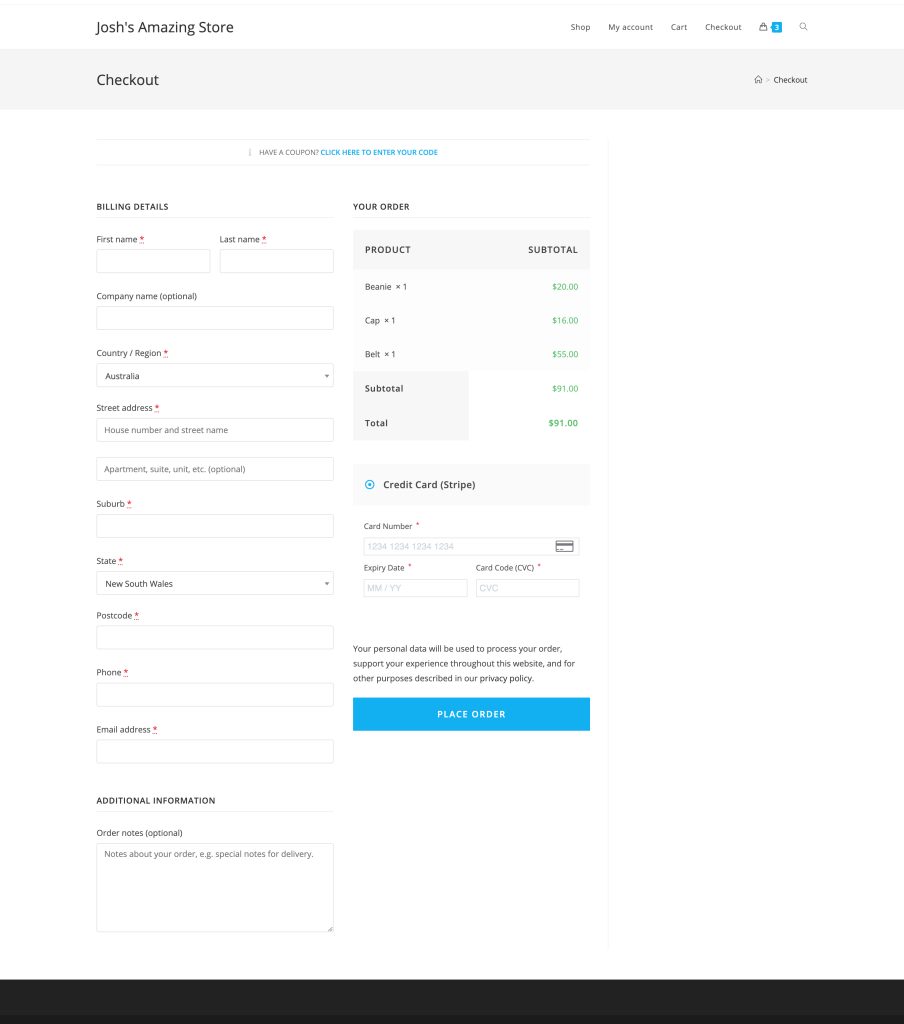
Here’s the existing checkout:

Your challenge is to rethink the UI/UX of this checkout page to streamline and lower the abandonment rate.
Task:
- Conduct an evaluation of the current checkout process.
- Identify at least three pain points in the user journey.
- Create wireframes for an improved checkout flow that addresses these pain points.
- Explain your design decisions and how they contribute to a frictionless user experience.
- Bonus points for creativity 🙂
Before You Start (Important Notes!)
We understand your natural inclination is to get this 100% pixel perfect and provide a great finished looking design, but what we actually want is to see your thought process.
This is an exercise in understanding and improving the User Experience (UX).
For your benefit, and ours, here’s what we’re going to be looking for specifically:
- Did you understand the assignment?
- Was your solution better than the orginal? ie. Did you reimagine the interface or just rehash what was there?
- Is it clear that you thought about the user’s experience in using the interface?
- Did you explain yourself well?
- Did you demonstrate design skills & knowledge?
- Did you demonstrate creativity in your solution?
Tools
- Deliver your design in Figma.
- Download the screenshot image/s above to use as a reference. Click to zoom, then right click and save.
- Explanation accompanying your solution can be written or via a Loom/screencast video.
Submission
To submit your design, simple email back to the person who gave you the challenge and be sure to include:
- A Google Drive, Dropbox, or similar shared folder with assets.
- Any direct links to designs (ie. Figma shared link).
- Notes about your evaluation of the current checkout design, your observations, pain points identified, etc.
- Notes explaining your design decisions and the new flow.
Be sure you double check all links, shared folders, etc are all publicly accessible before sending.